Building an experience based on trust among customers, experts and Fazland.
Context
Simplifying people's life while seeking for a company or an expert to hire for a homework in a safe, transparent and merit-based way. To allow companies and professionals to look for serious and motivated prospects and customers.
These have always been the main goals for Fazland, while growing and gaining a round of investment worth 1 million € in 2015.
By the end of 2015, when we first met, Fazland had five years of expertise on its shoulders and a team of 18. We knew we were talking to a mature company, which looked like a startup only for their development-driven approach. They only needed a deep redesign.
From these premises, the goal of our collaboration was to make a qualitative leap and bring to maturity their product design.
Credibility, robustness and independence.
These were the key points of our work with Fazland.
Credibility
Fazland is a startup in feed stage, it has a working platform, and it is sustainable. Their goal is to become the industry leader.
This means that they need to pitch with a robust product to different types of investors. To achieve this goal, our work required a strategic approach from the ground. We began by designing a complete and consistent identity derived from the existing Fazland brand.
Robustness
We redesigned the whole platform, starting from Fazland B2C and B2B website and ending with a brand new mobile app.
Working together as a whole team, we redefined design, frontend and backend, improving user flows and building a styleguide system.
This basis is crucial to let Fazland evolve in an organic and coherent way without any redesign, but with an incremental evolution.
Independence
Fazland is a product-based company and, for this reason, it needed an internal team.
The project has been conceived to deliver not only a redesigned product and an improved experience, but also to allow them to grow up and scale on their own. We worked side by side passing knowledge, involving its team in our design methods and processes and instilling a user-centered approach in each new assumed functionality.
Lean UX nirvana
Working with Fazland team has been quite easy. They had a Product Owner always on project’s track and a dev team working in sync with us. On our side, we put together a full-time team including research, design and frontend competencies, empowering Fazland with a cross-functional team.
2-weeks iterations, a very short lapse of time between design and development, regular deliveries (4 milestones in 4 releases in 6 months). Our team received continuous feedback from both business viability and development feasibility points of view. We also had the chance to run user tests while in production, which means having meaningful qualitative insights and robust quantitative data.
On the other hand, we kept a rapid pace, which is normal when people are working in a well-oiled internal team, but it is quite unusual and challenging for an external team like ours. We needed to explore their domain, discussing and redesigning everything from scratch.
From Brand language to Design language. Incrementally.
Starting from Fazland existing two colours logo, we built a new complete visual styleguide including typography, colour palette and illustrations. Indeed, we redefined and extended Fazland brand identity.
We have chosen one single font, Proxima Nova, in its alternative version with the completely rounded A, in order to visually match the logo and recall its shapes. Typographic weights and absence of secondary fonts guaranteed a steady rhythm and contrast of the text components.
We have worked to inject the unique elements of Fazland brand in each part of the digital product so that users would find a consistent visual language and awareness even by switching from web to mobile devices.
As the relationship between customer and expert flows through services, where Fazland matches supply and demand, we decided that the icons expressing all services should have been part of the identity. That's why we designed an icon set including more than 200 tailor-made elements.
With the styleguides defined, we designed and developed, iteration by iteration, a library of incremental components and pages, creating a broad and coherent visual styleguide.
The first milestone: Two months to pitch to investors
The first goal of the project was to achieve credibility. Credibility towards users, towards experts relying on the service and, above all, towards interested investors during this stage.
Therefore, for the first project milestone, we decided to focus on brand activity, by reviewing visual language and by a full and in depth redesign of website public areas. Public pages are the ones that hook and convert users, experts and investors: the message must be clear, contents effective and the visual tone consistent and memorable.
Bi-weekly iterations, co-creation, interface design, frontend and backend development almost in-sync: in two months we had released the new Fazland website, redesigned from scratch.
Once we had published the first milestone, we ran a user research session, to validate choices we had just released and investigate in depth the interaction with the service. By interviewing users and testing with them the new Fazland public website, we gained valuable insights in which we rooted the redesign of Fazland most important part: the reserved area for user and experts, the platform’s core, where the relationship between supply and demand happens.
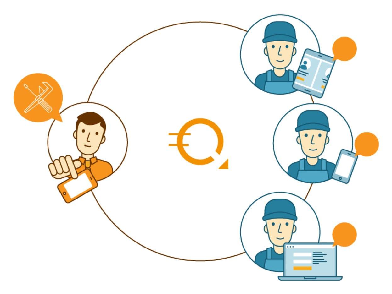
Two sides of the experience: the customer and the expert
The most complex part of Fazland is the reserved area for the customer and for the expert, where the first manages requests for proposal and receives offers, and the latter chooses interesting customers and proposes services.
Above all, in those two reserved areas it’s where the trust based relationship between customers, experts and Fazland happens.
Working on this part of the platform meant to deep-dive through Fazland monetization dynamics and business model, improving not only those aspects but performances too.
Improving the customer management flow (for Fazland, the customers are the experts) through service and lead them to monetization based on the model Acquisition - Activation - Retention - Revenue - Referral is what makes the service profitable and the startup sustainable.
In its value proposition, Fazland guarantees quality of the requests made by customers and of the registered companies. For this reason, Fazland has created a system of bi-directional public reviews and ratings between users and experts, over verification on both sides.
We worked to promote reviews, by communicating customers’ and experts’ value in a more efficient way, and translated verification systems in a natural step of the registration process, reducing the blocking sensation provoked by it.
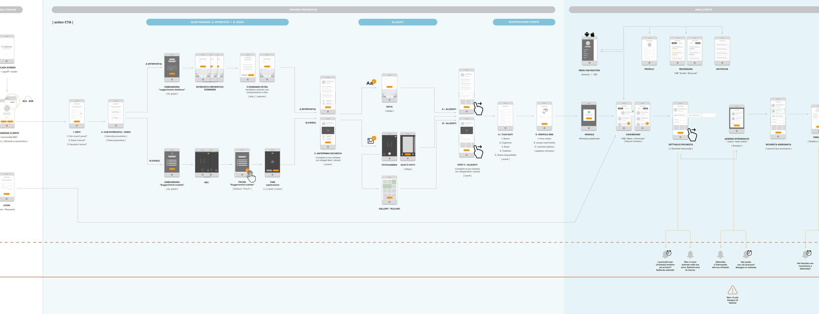
On a second step, we redesigned the two reserved areas driven by specific users' and experts' needs, by keeping as common ground the request of proposal lifecycle, as this is what ties together both experiences. On distinct stages, this is where both actors browse and decide.
Even if we kept things simple, we didn’t take for granted the reserved area first use, especially after subscription, so we decided to add an onboarding phase and a few contextual tips.
The three following project milestones involved the Blog, the User's Area and the Company Area releases. In seven months we completed the full redesign of Fazland platform.
Web responsive and App
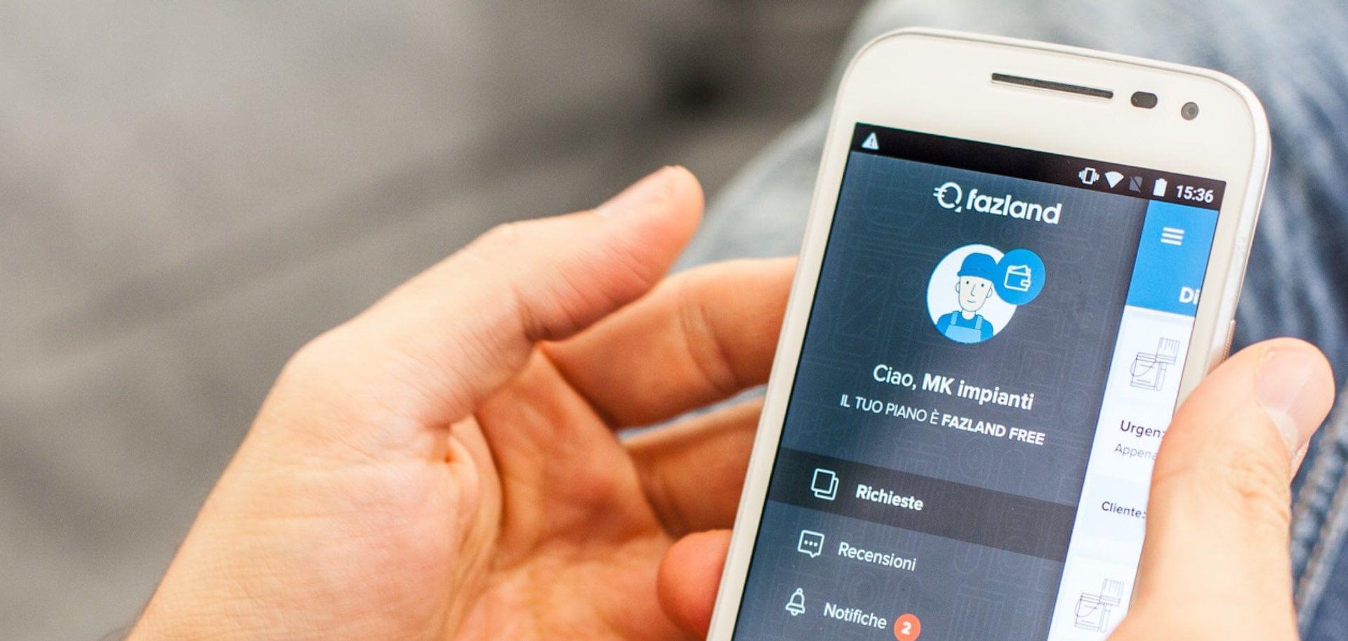
Fazland users browse primarily from mobile devices, experts above all, as they manage new requests and keep contacts with their customers. That’s why a mobile Android and iOS app had already broadened the experience in the past.
Now with a full responsive redesign, all the functionalities had been made accessible from whatever device, even in mobility.
So, what's the aim of the app? Why we re-designed an app to provide same functionalities and contents already available on the website?
We mapped Fazland users' and experts' flows and we tried to discover opportunities to focus on some peculiar features.
The map helped us in choosing only few functionalities through the app, leveraging on the context and smartphones features, to provide added value that wouldn't have been possible on a responsive website.For instance, while using the app, customers can record videos to describe their needs and complete their request. They can dictate contents into a form instead of filling it by typing on keyboard. They can add a photo to describe the area where the expert is called for work (most of the requests are about homework).
For experts, instead, we focused on immediacy in receiving and filtering the closest and more interesting requests, improving lead generation.
The app, developed with a hybrid technology, in order to be compatible with iOS and Android, it’s now in development phase with the e-xtrategy team