Improving platform user experience for better travel agents operations
Categories
B2B
Travel
Travel management
Activities
User experience design
User research
User interface design
Front-end development
Design System
Pattern library
Duration
12 months +
Stakeholders
CEO; CTO; Frontend e backend developers; Sales; Marketing.
Challenge
The redesign process aimed to rethink a B2B travel platform and optimise the user experience for the travel agency segment.
Specifically, the project challenge hinged around two pillars:
The consolidation of a better user experience for travel agents in order to maintain current customers and open up to new business opportunities for the company
The construction of a coherent and robust visual language, capable of strengthening and enriching brand identity through the implementation of new elements
A further challenge was consolidated at operational level, since we worked closely with the company's in-house development team implementing the design system, so that they could work independently on a robust tool of code maintenance and optimisation.
Design Vision
Once we defined the platform’s strategic objectives for 2020, we proceeded to work on building a solid basis for the subsequent executive phase of Lean Design and a medium-term vision of the product.
First of all, we took advantage of a local opportunity: one of the most important national trade fairs for tourism. This allowed us to better explore the platform's domain and understand needs and expectations of travel agents on site.
Therefore, we interviewed 8 travel agents in 8 different research sessions, in which we simultaneously explored their platform use, highlighted critical issues, opportunities and goals.
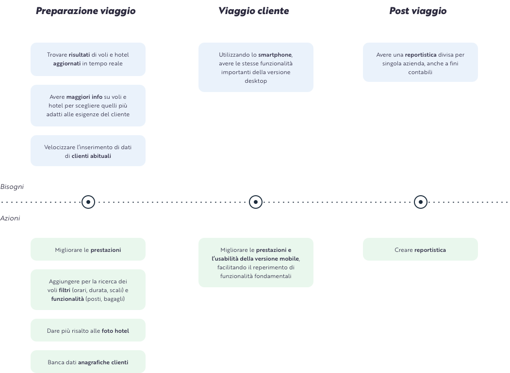
Queste informazioni ci hanno permesso di portare a terra un set di assumed personas, ciascuna corredata da una sintetica user journey che mettesse in relazione bisogni degli agenti e azioni facilitate dalla piattaforma.
This information allowed us to create a set of assumed personas, each linked to a concise user journey able to connect travel agents needs and actions optimized by the platform. At the same time, we organized co-design sessions involving the client's internal stakeholders to create a set of functionalities that we divided into three blocks:
First release: functionalities that meet the primary needs of the identified personas and satisfy medium-term business objectives of the company
Backlog: functionalities that meet the secondary needs of the personas and satisfy long-term desires
Parking lot: functionalities meeting the primary needs of the personas to be validated taking into account business objectives
Therefore, the Design Vision’s output consisted of a medium-term product vision in which we gave indications on how we would imagine feature evolutions and how they would facilitate the task of travel agents. Within this vision, the Design System represents the basis of product evolution and growth over time.
Visual language: consolidation and extension
The product lacked solid brand identity guidelines, that would describe it in a recognizable and coherent way. Through a constructive and always open dialogue, we analyzed together primary platform aspects that characterise it as a product in relation to the company; hence we were able to build the basis to consolidate and improve the visual and brand identity.
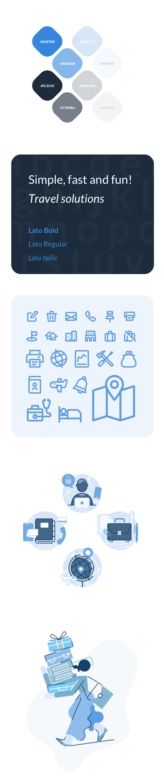
The platform is informal, transparent and accessible, as well as reliable and secure in its daily use. The communication with the customers is fast and direct. The identity is solid and recognisable, characterised by a palette of blue: the brand's primary colour.
After mapping its most intrinsic aspects, we developed specific guidelines for tone of voice, content writing and visuals. Furthermore, we defined the key elements of UX writing and perceptual aspects such as colour palette, typographic scale, grids and spacing, shapes and iconographic system.
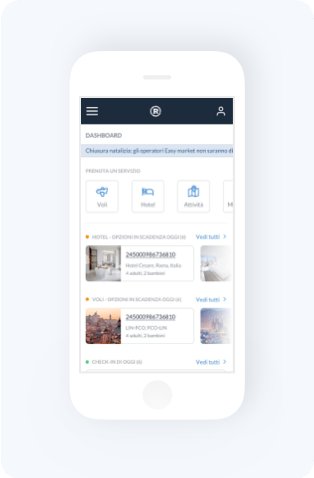
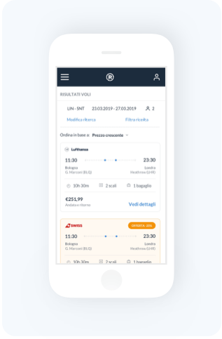
Communication is direct and concise: the language is simple and clear, often associated with icons or illustrations for better content conveyance.
The look and feel is minimal and clean. The extensive use of white as background colour highlights content, images and information on the page. The typography and colours have been studied in detail to ensure the right rhythm, correct hierarchy and a harmonious and balanced balance between the interface elements.
The iconographic set is also connected to the visual layout: it embodies it and completes it, expanding the interface and giving immediacy and clarity to content and actions. The outline icons have been designed using a scalable, simple and clean style.
The visual system is designed to create an ergonomic and functional platform that guarantees content and action clarity, as well as ensuring a consistent and distinctive brand identity.
Mapping and simplifying complexity
The preliminary and foundational activities for all subsequent designs included mapping the existing material, understanding flows and reconstructing back-end architecture.
We had to manage a complex system made of deeply interrelated elements. We mapped, documented and reviewed purchasing flows and payment systems. We outlined the relationships between agencies, agency networks, companies, companies intermediated by agencies and the client. We defined users profiles, roles, permissions and master data. Working together with the client’s IT team, enabled us to fully understand the system and propose implementable solutions, fitting to their management and data structure.
This stage allowed us to make design decisions aimed not only at implementing new features and sections, but also at improving point and micro-detail improvements that would make the daily workflow faster and more efficient.
Gathering information within a single design system
Once the visual guidelines, workflows and interactions were defined, we began to think of the project as an organic, coherent and scalable system, rather than a collection of individual pages. Iteration after iteration, we built modular components that allow for flexibility of use, faster workflow and consistency in visuals and interaction.
We incorporated UI components, interaction patterns, templates, documentation and various resources Within the Design System: a centralised, shared and constantly evolving resource to ensure common knowledge and constant alignment for the whole team involved.
The entire team was actively involved in this process, contributing to prepare a set of documents that would be as complete as possible from all points of view: from design choices to iconographic system guidelines up to the developed code.
After a few months of development, it was agreed with the IT team to migrate the code infrastructure to their servers, repositories and systems so that the Design System would be integral to the product and could run in parallel with it, acting as both a technical and design glossary.
This was an extremely important phase for both teams: on one hand we were able to better understand the characteristics, peculiarities and constraints of the product's code base and thus be able to adapt our way of writing code. On the other hand, our client was able to understand even more the potential and the relevance of the Design System as an auxiliary tool for making the platform flexible, scalable and maintainable over time, especially in terms of working independently.