Focus Junior online presence: more than just a website, a community designed for kids.
The brief
Grüner+Jahr/Mondadori (G+J/M) is a publisher of both paper and digital magazines, such as Nostrofiglio.it, Focus, Focus Storia, iFocus and Geo. They called us to redesign Focusjunior.it, the online presence of their magazine for kids, asking us to design not just a new interface, but a whole new online experience that feels entertaining for kids between 8 and 13 years old, while keeping them in a safe environment (they are underage for Facebook and most other social networks).
Like other past projects, such as Jacktech and NostroFiglio, we teamed up with Ideato to complete the spectrum of skills required to build the project, from user experience design to backend development, going through visual design and frontend development. We and Ideato also both work with Agile methodologies, meaning we are able to work in short cycles and with a cross-functional team.
Kick-off and goals
G+J/M web unit gave us a brief for the FocusJunior.it project, with specific requirements, precise graphic (and taste) directions and Gantt charts. Our work started here, with the brief. In the first meeting we helped G+J/M team define and clarify their business goals and the strategy behind the project and the magazine.
The following goals emerged:
Boost the magazine sales through the website, in a context where monthly paper magazine are selling less and less copies
Increase website traffic, also from mobile devices, and build a loyal user audience
Increase depth of navigation through website contents
Motivate users to spend more time on the website
Help reach revenue goals (magazine sales + online advertising revenue)
The process of guiding G+J/M team to step beyond the brief and define better project goals has also inspired Ilaria and Marianna’s talk “Cosa manca ad un Brief” at BetterSoftware 2013.
Discovery
Since the very first discovery iteration, we involved the whole project team, including Ideato, G+J/M project manager, the editors, the marketing department and all the people working more closely to kids and users. We let everyone’s role and expectations emerge, in order to align to the business and strategy goals.
"FocusJunior.it has two main users: the kids, called “focusini”, and the editors who write and publish contents and services. Both are users and both help generate contents and make the website grow. The whole design process put these two users at the center."
We defined a logic and semantic information architecture that enabled us to create a first sitemap. This was extremely helpful as we had to merge existing sections and contents with new ones, both editorial and user-generated.
This sitemap also helped us write User Stories (the definition of an action done by a user of the website, in order to satisfy a need or expectations or accomplish a task) together with the client and the development team. We then prioritized User Stories, based on constraints (both execution-related and business-related), understanding deadlines and estimating a roadmap of design and development activities.
"This generated a roadmap made of two major releases: the first one, an editorial website, the second one, a community for kids"
Relase #1: editorial website
The goals of this first release were:
Design the new user experience of Focusjunior.it and build it
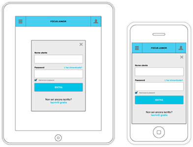
Implement Focus Junior brand into a visual language that is fresh and fun for an audience of kids between 8 and 13 years old, and at the same time suitable and consistent in a multi-device responsive project
Build areas for editorial contents from Focus Junior staff
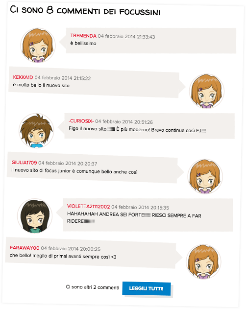
Build areas for user-generated content, allowing kids to publish their own content, add comments and join the discussion
Give kids a profile page with a customizable avatar, to build their own identity and begin to take part into the life of the community, with small, easy features at this stage.
The goals for this first release looked pretty straight-forward. Though, Focusjunior.it is different from many other websites, as its audience is underage and needs to be protected on the privacy side: registration needs approval from a parent and all contents are manually moderated and approved from Focus Junior staff. Even obvious actions like uploading a picture to a post or a self-portrait as an avatar arise ethical and legal isssues in Focusjunior.it and need to be addressed carefully: the risk of spreading personal pictures of kids on the web (like avatars) and of exposing kids to material not suitable for them (like unmoderated user-generated content with sexual or offensive images) were our two priorities. To cope with the first issue, we hired an illustrator to draw a series of characters, that users can pick as their avatars, keeping the identity, customization and fun qualities, while avoiding privacy and legal implications connected to uploading kids’ self-shots. At the same time, the editorial staff drew illustrations of themselves, using the same visual language, becoming all characters of the Focusjunior.it online world.
The visual design process had to aligh to another important event: the restyling of the paper magazine. G+J/M graphic team roadmap was different from the website design and development roadmap, so we had to start working with a rough styleguide to enable prototyping, while waiting for brand guidelines. Once we received the first drafts from their graphic team, we expanded this styleguide adding elements of brand and visual design, using the same visual language as the magazine while extending it to be consistent in a cross-device web scenario. Again, we turned odds into opportunities: we built working prototypes, with Javascript interaction, to test the user experience and defined user interface guidelines, and then added typography, colour and visual elements incrementally, abandoning the usual “big reveal” and working in small chunks.
We put a lot of effort into working with the marketing department,the advertisment provider and the development team, to find placement and make advertising work in a responsive design scenario, keeping in mind that banners are the main revenue stream for the website.
A lot of care has also been dedicated to working with colour and images in the visual design. Focusjunior.it should look entertaining, fun, without looking too naive or too childish: we need to appeal to 8 years old kids as well as to 13-14 years old teens.
The editorial website was launched in February 2014, together with issue #121 of Focus Junior: a whole new look, both on paper and on the web.
For Focus Junior, this event sparked a wave of new contents for both the magazine and the website. The increase of new users, from page views to mobile device, shows that kids are liking the new Focusjunior.it and love accessing its contents from smartphones and tablets.
Release #2: Community
A challenge. From the initial brief, the ideas was to build a kind of Facebook for kids, but the constraints arising from privacy, security and content moderation were intimidating, as well as the budget cap. We tried to turn odds into opportunities, and we went back to the strategic plan, discarding the solutions proposed by the brief, to design something that matched users expectations and business goals, moving inside the constraints.
Enabling kids to interact and build relationships between each other, giving them their own profile page with their favourite contents, allowing them to follow their interests and receive updates from their likes and their comments were the real value of Focusjunior.it.
Wrapping up: the goal was putting kids at the center of the life of Focusjunior.it.
Hey, we have a new user profile!
We chose to use a Twitter-like follow and unfollow pattern for enabling kids to build relationships. we chose this over the friendship pattern because it’s quicker, more open and non reciprocal, helping preventing closed groups, exclusion, rejection and other behaviours that could harm the more shy and sensitive kids. Also, the follow pattern enables adding competition (most followed users), that could eventually lead to adding gamification mechanics with rewards and badges, opening up interesting scenarios for future releases.
The same rationale goes for user-generated contents: by showing their contributions in their profile pages, we spark the motivation to follow an user, to join a discussion or to create new content yourself. And maybe beat your friends becoming a superstar contributor! This all translates to more traffic, higher engagement and longer time spent on the website, which are the main KPIs for the project and directly functional to G+J/M revenue stream based on advertising.
Since February 2014 visits and page views have increased significantly.Traffic coming from mobile devices also increased during these months, being a strong confirmation of the strategic goal to deliver a better mobile experience through responsive design.
Value beyond results. Day by day work, user stories, iteration meetings, iterations and Agile teams that break into a company culture based on Gantt charts.
Working side by side with the client and Ideato, we slowly introduced elements of Agile methodologies in a company historically based on silos-like departments and sign-offs , coming from the print world. Although far from perfect, we managed to set up a pseudo-Agile process made of bi-weekly iteration meetings that helped everyone share the status and the purpose of the project, with stakeholders giving constant feedback and switching from a fixed roadmap to a more flexible one that accepted change.
Once publishing the first release, we hosted the whole team in our office to run a retrospective meeting, letting successes and pain-points emerge, with the goal to inform choices and work better in the second half of the project. Part of our commitment was to give G+J/M team new tools to manage the project, and we actually brought elements of Lean culture into a company used to waterfall processes, with the result of involving the client into the design process and play a better role in managing a team instead of just managing contractors.
Eventually, designing Focusjunior.it was all but a kid’s game :)