Internet Project & E-commerce, Business Aviation, Business Non-Aviation, Communication, Innovation, ICT & Quality, Airport Operations, Customer Care, Investor Relations, Infrastructures, Legal e Privacy, external consultants, external development partners.
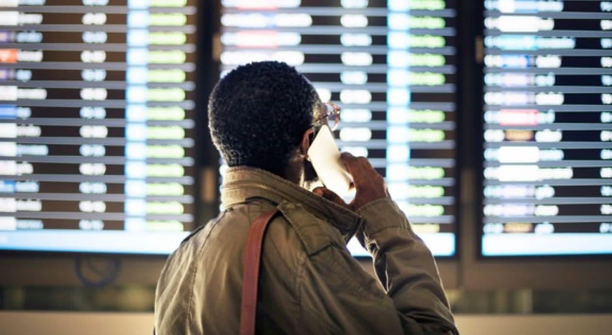
Always with the passenger in mind
In September 2017, we had the opportunity to start working on a website redesign project with Bologna Airport. It has been a challenging journey, a three-year experience that is still with us today as we measure results, test with users and constantly improve.
Want to find out more about how we designed Bologna Airport website?Read our case study
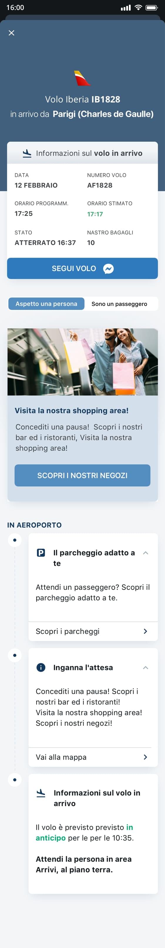
Redesigning the web experience has led to the creation of solid foundations to undertake a new project in 2020. Together with our technological partner Mavigex we worked on rethinking and redesigning the app experience, thus making the two touch points aligned with each other and in synergy. Our goal was to provide the best possible assistance to a passenger during the journey.
Vision, complementarity and revenue
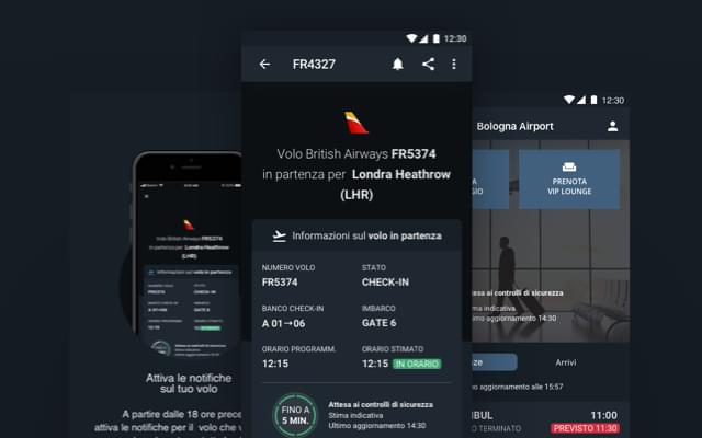
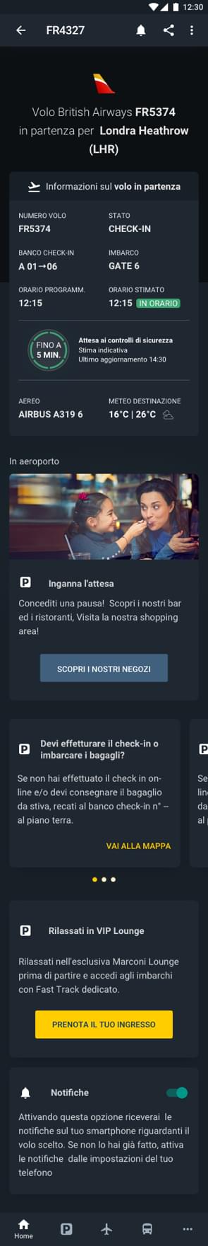
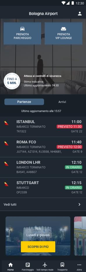
Aeroporto di Bologna was already present in the app stores with two apps, one for iOS and one for Android. Both apps - developed before the new website design - were solid and guaranteed support to passengers in the most important phases of their journey, such as booking a lounge entrance or quickly retrieving a reservation to access the parking area.
While approaching the app redesign, we started with an overall vision to then focus on the complementarity and interactions between the two digital touchpoints. In fact, the website and the app were previously considered as separate elements.
We worked not only to make consistent standardised interaction flows and increase the mobile revenue, but also to elevate the user experience within the two touchpoints.
A good product must be designed keeping in mind the different contexts, needs and multiple touchpoints in which it is used.
Mapping to choose the right direction
There is a moment during a project when a question must be answered: “what kind of application design would be more effective?”. The choice is not obvious and can depend on many different factors, such as business strategies and product requirements. Making decisions in this regard has a consequent impact on the brand’s user experience.
Working on a cross-platform product is complex as there is a need to standardise as much as possible both the information architecture and the experience, by comparing, evaluating and choosing the best operating system’s native patterns. For example, the type of navigation can be very different if it is designed for web, iOS or Android. Consequently, solutions designed for a mobile application or for responsive websites are very different.
In the case of Bologna Airport, the starting point was a hybrid solution (iOS+Android). Both platforms used very similar patterns without paying particular attention to the specific native patterns of each.
The same page can appear differently on iOS or Android. This doesn't mean that one must sacrifice consistency. Following the device’s system patterns can make it easier for the user to recognise them.
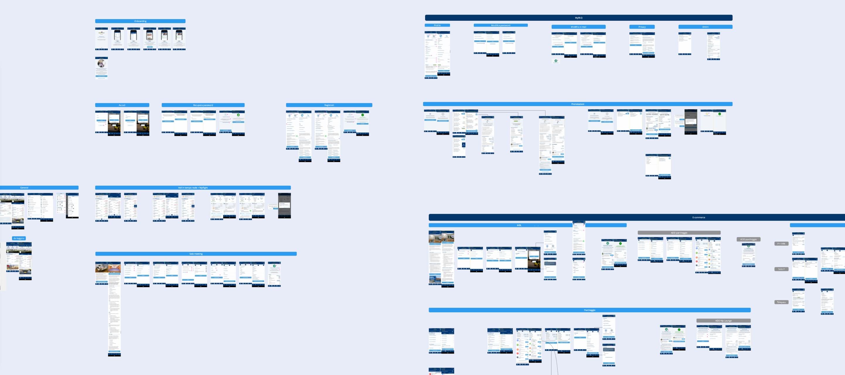
Starting from a hybrid situation between iOS and Android made it necessary to carry out a phase of analysis and study of all the existing screens. The aim was identifying areas of intervention and cataloguing a patterns inventory to differentiate between iOS and Android and, at the same time, understand which different components could instead be standardised.
Extended mapping of Bologna Airport iOS and Android app
By mapping the entire app ecosystem, both iOS and Android, we were able to identify the points of friction and improve the experience. When dealing with multiple touchpoints, such as for Bologna Airport, it is crucial to take care of online information and services in a coherent, fluid and complementary way. This prevents the user from being disoriented by contrasting information coming from different touchpoints.
In this case, we are referring to consistency, i.e. the design ability to make the product's usability solid, uniform and recognisable.
Design system, potential in scalability
One of the goals that pushed the entire redesign was to align both stylistically and functionally the passenger’s main first contact channels: the digital touchpoints. The design system built during the creation of the new website served as a guide for this transition. The style, the colour palette, the choice of spaces and elevations: every component had been conceived and designed for the website. We had to create a mobile applications scalable design system able to transfer and contextualise every single choice. As a matter of fact, this made continuity possible in several environments while allowing the creation of new elements.
Dark mode. It's not all about black
An important extension to the design system: the dark mode version was a further improvement to iOS and Android applications.
Redesigning iOS and Android platforms in light and dark mode has made Bologna Airport’s app stylistically flexible and allowed an easier interface customisation for a better user visual experience.
It is not all about converting light colours into dark colours, it is about enhancing the perceptual contrast to allow greater content accessibility by adapting it to the user's viewing preferences. Normally, strong contrast due to a dark colour scale makes the content prominent. In this sense, a good design is a priority because information and actions must be even clearer and more accessible, especially on the User Interface.
Colours
We went back to the style guides, enhancing and institutionalising a dedicated color palette that would allow a correct, functional and, most importantly, accessible shade of dark colours, through the combination of contrasts between background and content.
Typography
We also intervened on the texts, especially the white ones, by choosing a less bright and more saturated colour, in order to reduce as much as possible the halo effect that is perceived due to high contrast between light and dark colours and tires the eyes.
Elevation
We have worked on elevation, finding different shadowing solutions for the light version in order to accentuate key content visibility and create regions of visible elements to enhance the readability of data and information.
What we have achieved
As a result of this redesign we have:
Structured routines of twice-a-week alignments between teams to monitor releases and carry out cyclical Quality Control activities.
Improved consistency, extensions and robustness of the multi-device experience for Bologna Airport passengers and users.
Increased content accessibility by strengthening the design system with both cross-platform adaptations and dark mode studies.
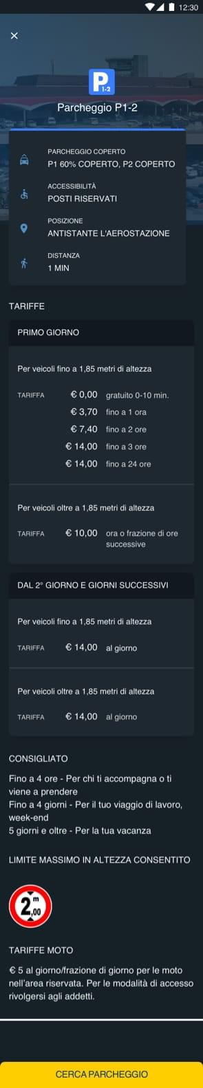
Unified the purchasing experience on Bologna Airport products and services online, making it easier to increase revenue on mobile touchpoints.
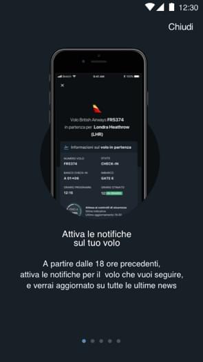
Created a more complete and rapid search of flight information, passenger guide, services and commercial activities within the airport.
All this was possible thanks to the constant alignment objectives and intentions of teams and suppliers involved in the redesign and development of Bologna Airport’s iOS and Android app.
📌 We are closing the last activities before the official release of the app. It will be online soon! Follow the Bologna Airport social channels to stay updated on when it will be published on the iOS and Android stores.